R O L E
My role for this project was lead designer of the Interaction Design of the global website. For this project, I spend a lot of time on doing research on design choices. I collaborate with the clients and user testers to get to the current result.
C A S E
Bridging the gap between healthy and fast food on high traffic locations in the Netherlands.
Abel’s Deli opened in 2017 with one clear mission. Serving healthy, fresh and delicious food at high traffic locations. The problem with high traffic locations such as airports and train stations is if you want to have a quick meal, you have to go for an unhealthy snack.
There is a clear profile of people who are visiting these locations. First of all. They have a purpose to reach a destination. And they are all in a hurry, all the time. So, we came up with a solution to bridging the gap between freshly and healthy prepared food and rush.
I designed a mobile solution to order (and customize) your food, wherever you are. And pick-up whenever you want. First I started to design a customer journey of a person in an ideal scenario.

C O N C E P T
With food, I always believed in a good balance between white space, imagery, and text. If you order food, nobody really wants to read a long story. It doesn’t fit with the target audience either.
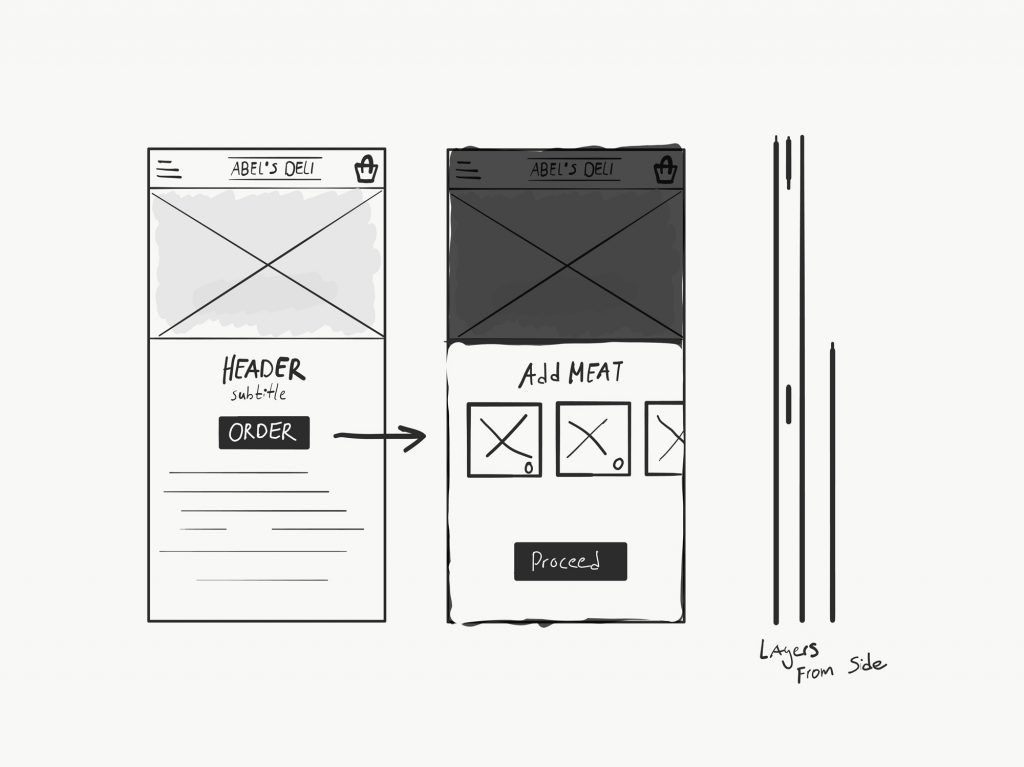
I designed a concept where the user has the power of customizing their dish. With the toggles, you are able to add as much from a specific ingredient as you want. Because ‘personal’ is one of the things that matter at Abel’s Deli.
In my opinion, it was important to fit the needs of two users. The one who wants a personal dish and the people who don’t have much time. So, we came up with two buttons: “order now” and “customize”. I tested three positions of the buttons.

I conducted a user testing for three button position options. 89% of users found option C the best, the main reason was that it felt more fluent to separate the layers of the customize part and the information part with a button hovering on the ‘hidden’ layer.

Back to the drawing board
After a couple of months, I came together with the client to reflect on the results. Users were very positive about the customize availability. Unfortunately, the customize was a distributional disaster at the stores. People were able to say: “I want 7 pieces of chicken and 20 grams cheese”. And that was very hard and time consuming for the kitchen aid.
So, we went back to the drawing board. We were sure to remove the detailed customization option for a more decent way of customization. How? We decided to remove the toggles and came up with just a checkbox. So, the users could check or uncheck to options they want or don’t want.

I came up with a new design that also was suitable for other products like pastries and sandwiches. During the user test, I came across the problem, that most of the users are not mentioned the ‘topping’ part. That’s an important part of the customizing process.
A lot of users were also mentioning there was too much information on the screen. There was less contrast between elements than the previous version. So I took the design to the next iteration.

In this part, I designed a clear timeline. My thoughts about the customize process are that the website has to guide the user through the process, instead of the user guides the website to a point. And that’s what I did with my second iteration.
In this iteration, I decided to get back to the layered idea of concept 1. Because from a user perspective, it worked out very well. Because it gave the whole composition a good contrast and users were less confused.

R E S U L T
The result of this project is a more decent way of customizing for both user and the person who is responsible for preparing the meal. This new design will released in Q2 2018. Stay tuned!
